
Cover page my favorite colour blue and yellow.
 made of box board and the font is cut out from the box. There is the contrast of emerging and hole, to have more depth to the cover.
 My Content page features the navigation that i used. It is through the use of the number and colour that change from the light to the darker hue. These colour also used on the strips that connect two pages.

 oops!! It is up side down..
The alignment of the number is base on the content page, so it goes down as the number get bigger. I keep the whole layout simple and very control alignment, cause that is the things that inspire me from the precedent book. Leaving lots of white space, since the page next to it will be image with full size of page. I used two type of paper the glossy kind of paper and the water colour paper. Glossy for something i did with the help of computer program...
water colour paper for the one i did by hand... so will have a bit of texture...

glossy water colour

glossy
glossy
glossy
glossy
glossy
water colour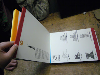 water colour
 matte paper
 made of box board and the font is cut out from the box. There is the contrast of emerging and hole, to have more depth to the cover.
 My Content page features the navigation that i used. It is through the use of the number and colour that change from the light to the darker hue. These colour also used on the strips that connect two pages.
 oops!! It is up side down..
The alignment of the number is base on the content page, so it goes down as the number get bigger. I keep the whole layout simple and very control alignment, cause that is the things that inspire me from the precedent book. Leaving lots of white space, since the page next to it will be image with full size of page. I used two type of paper the glossy kind of paper and the water colour paper. Glossy for something i did with the help of computer program...
water colour paper for the one i did by hand... so will have a bit of texture...

glossy
 water colour
glossy

glossy

glossy

glossy

glossy

water colour
 water colour
 matte paper
No comments:
Post a Comment