Sunday, June 14, 2009

Project 3 : Art Galley, Shop/ House

Project Brief:
Displaying contemporary, experimental objects and images, and efficiently running a gallery requires that a number of practical, yet important, architectural problems to be dealt with (especially, light quality, gallery image, suitability of the display areas, safety of the art works, and commercial viability). At the same time, questions of a more theoretical kind concerning the nature and relation of art and architecture need to be addressed.

In this project, the following should receive your main attention:

. the question of whether the architecture should provide a neutral and autonomous framework within which the art is displayed, or whether the architecture should in itself be seen and expressed as work of art;
. the manner in which a variety of relatively autonomous spaces, each perhaps with its own character, can through circulation and other means be linked to develop a strong spatial sequence; to create a sense by the viewer that she/he is engaging with the artworks; to produce a quality of celebration;
. to design plans and sections that are clear, rich and appropriate in terms of the architectural orders and architectonic elements used to distinguish the gallery;
. to develop an interweaving of the plan and the section, where one ‘dialogues’ with the other;
. to produce a strong sense of materiality and a consciously designed and refined quality of light in interior spaces; and
. to treat the outdoor courtyard as a room, and its form and architectonic element are integral to the overall concept, composition and experience of the gallery.


Programme:
. A large room capable of displaying paintings and sculptures up to 5 square meters and for relatively large installations.
. Smaller room(s) for displaying items such photographs, watercolours, prints and small sculptures.
. An office, minimum of 10 square meters.
. Workshop, minimum 20 squares meters.
. Stockroom, minimum 20 square meters.
. A small bed-sit apartment with bathroom, minimum 40 square meters.
. A living area adjacent to the apartment which has kitchen facilities for gallery functions, 20 square meters.

There are three sites to choose from. I picked site 3.

Site Analysis

Site 3 is located in between of two buildings, which are roughly about two storey on the left and three storeys on the right. The site itself is 16 meters wide. The site can be accessed by both vehicle and pedestrian either from the front or rear. Main busy traffic is obviously at King St which is the front of the building, with the traffic light located in front of the site. Access to the rear of the building is quite and narrow street. The façade of the buildings surround the site is mainly Victorian Style. 


Artist and Precedent

Artist
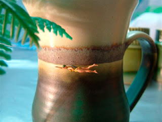
Elaine Campaner is a local Australian photographer, who explores taking photo using everyday objects that she could find in her house and creates a scene of a certain events or landscape.


Source: http://damienmintongallery.com.au/artists/elaine-campaner/

Precedent Study --> Higgins Hall Centre Section, New York
I study the work by Steven Holl the Hinge …. Which is a sandwich site like the site I choose. I picked up on how Steven Holl tried to create a connection between the two existing buildings and represent it in the building that he designed. He based the design on the floor level lines and then designed a series of lines which meet together in the middle of the building.


Gallery Visit


Progression

By looking at Steven Holl work as precedent, my approach for the design of the gallery is attempted to create two masses that join together in a way that represent the verticality of the higher building and the horizontality of the lower building building.  With these two masses, I could have a wide glazing façade for the gallery display, which is appropriate as the street is busy and wide glazing will help capture the attention of the pedestrians. On the other hand, I could also have a two-storey height area that emphasis the wide space in the gallery.

Further development of the design involves in a better organisation of space and the location of the stairway for the gallery. I try to keep my gallery space as big as possible and with a long wall without any disturbance. Thus it will help create a more generous space for people to enjoy the artwork. I design the courtyard to be on the first floor. The reason for this is that the area around the site is busy and by having the courtyard at this level, it engages the insider to be part of the streetscape.

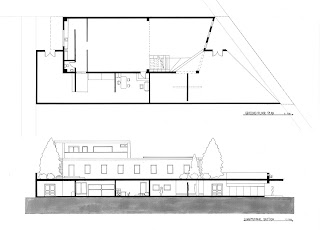
The programme in my art gallery is having a public (gallery) and semi public area (office, workshop and storage) at the ground level, a public (gallery and courtyard) are on the first level and a private apartment for the art dealer on the second level. The private apartment is located at the rear of the building. It is due to the art dealer fascination of having a quite and calm place far from the business of the street.

Lighting control in the gallery is through the windows and skylights. The windows on the first level are design so that light still can come through in between the artworks that hang on the wall. However, the use of skylights has been considered too much since I do have the high windows running from ground through the roof at the front façade. As a result, I might just omit the use of skylights since the sunlight from the windows are enough to light the gallery area. 

first progression

second progression

Final Drawing


Model